GYM LOGO DESIGNHere it is, your signature! Take a moment to really consider the importance of this one design: it will be on your sign, on your merchandise, on your website, everywhere! You have to LOVE your logo and be proud of it. Your logo should reflect the personality of your box and possibly highlight what you find most important about your gym. After all, this box is your baby so your relationship and/or history with health and fitness should be a part of it.
|
|
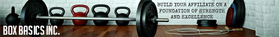
Logo Ideas
Logo Design Packages by SignsRx
You do not have to be a graphic designer to come up with your own logo. There are plenty of “do it yourself” websites such as www.pixlr.com and www.picmokney.com. Your logo will be one of many things that will need to be designed for your box so it’s not a bad idea to become familiar and comfortable with one of these sites. Experiment with lots of different ideas and when you finally create the right one, you will know.
Designing Your Logo
So, although you want to own a gym and not become a graphic designer, it never hurts to simply give it a shot. You might discover you are not bad at computer graphics. Keep it easy to read and fairly simple. The name of your gym should stand out more than anything else. It takes A LOT of time to design anything so brush the dust off of your patience and plant yourself in front of a computer for a couple of hours. After all, if you discover that this project is out of your reach, you can always hire a professional.
First, start with the colors. Find the right shades of the colors that will represent your box. You can use any of the above mentioned design softwares, Power Point, Publisher, even Microsoft Word to experiment with different shades of the colors. One color is boring, two are easy to work with but three colors will produce a clean and eye catching logo.
Second, find the font. Type your box’s name and experiment with different fonts to see what those words look like in lots of different options. “Dirty Ego” is a popular font used in plenty of gym’s logos but be leery of two things: stale ideas and printing complications. Any distressed font with blurred lines does not translate well for stickers, t-shirts or anything else you plan to put your logo on. You will spend unnecessary money on reprinting if you choose to a “complicated” font. The most consequential aspect of choosing your font is whether or not it is legible. If the average person could not read your font quickly and clearly, it is a poor choice.
Third, find the shape or visual representation of your logo. Do your research and see what’s out there. Inevitably, you will be drawn to one logo over another- when that happens, stop and ask yourself, “why do I like this?” Maybe it’s 3D, or has a clever design, or you like the mascot BUT whatever the reason is will help you get one step closer to learning what you want in your logo. This will be the hardest step to commit to since this shape, image, or design is what makes your logo more appealing than others.
Lastly, remember to take your time. Rome wasn’t built in a day and logo’s aren’t created over night, especially if you are learning a new design program in the process. Ask others for their opinion of your logo, apply their constructive criticism and continue to play with the images until you find discover the logo that you love.
- A silouette of you or a graphic person working out
- Use pieces of equipment as letters. E.G. Idaho could replace the “o” with a rubber bumper.)
- Incorporate the landscape in the area you live. E.G. mountains, ocean, snow, etc.
- Pick a word from a different language that means something to you and incorporate it in your logo.
- Choose a couple different fonts and apply them to separate words.
- Use a family crest.
- Use famous landmarks around your city. E.G. Brooklyn Bridge, White House, New York City skyline.
- *Stale ideas: Skulls and barbells bending
Logo Design Packages by SignsRx
You do not have to be a graphic designer to come up with your own logo. There are plenty of “do it yourself” websites such as www.pixlr.com and www.picmokney.com. Your logo will be one of many things that will need to be designed for your box so it’s not a bad idea to become familiar and comfortable with one of these sites. Experiment with lots of different ideas and when you finally create the right one, you will know.
Designing Your Logo
So, although you want to own a gym and not become a graphic designer, it never hurts to simply give it a shot. You might discover you are not bad at computer graphics. Keep it easy to read and fairly simple. The name of your gym should stand out more than anything else. It takes A LOT of time to design anything so brush the dust off of your patience and plant yourself in front of a computer for a couple of hours. After all, if you discover that this project is out of your reach, you can always hire a professional.
First, start with the colors. Find the right shades of the colors that will represent your box. You can use any of the above mentioned design softwares, Power Point, Publisher, even Microsoft Word to experiment with different shades of the colors. One color is boring, two are easy to work with but three colors will produce a clean and eye catching logo.
Second, find the font. Type your box’s name and experiment with different fonts to see what those words look like in lots of different options. “Dirty Ego” is a popular font used in plenty of gym’s logos but be leery of two things: stale ideas and printing complications. Any distressed font with blurred lines does not translate well for stickers, t-shirts or anything else you plan to put your logo on. You will spend unnecessary money on reprinting if you choose to a “complicated” font. The most consequential aspect of choosing your font is whether or not it is legible. If the average person could not read your font quickly and clearly, it is a poor choice.
Third, find the shape or visual representation of your logo. Do your research and see what’s out there. Inevitably, you will be drawn to one logo over another- when that happens, stop and ask yourself, “why do I like this?” Maybe it’s 3D, or has a clever design, or you like the mascot BUT whatever the reason is will help you get one step closer to learning what you want in your logo. This will be the hardest step to commit to since this shape, image, or design is what makes your logo more appealing than others.
Lastly, remember to take your time. Rome wasn’t built in a day and logo’s aren’t created over night, especially if you are learning a new design program in the process. Ask others for their opinion of your logo, apply their constructive criticism and continue to play with the images until you find discover the logo that you love.
